Atlanta Dream
Chicago Sky
Connecticut Sun
Dallas Wings
Golden State Valkyries
Indiana Fever
Las Vegas Aces
Los Angeles Sparks
Minnesota Lynx
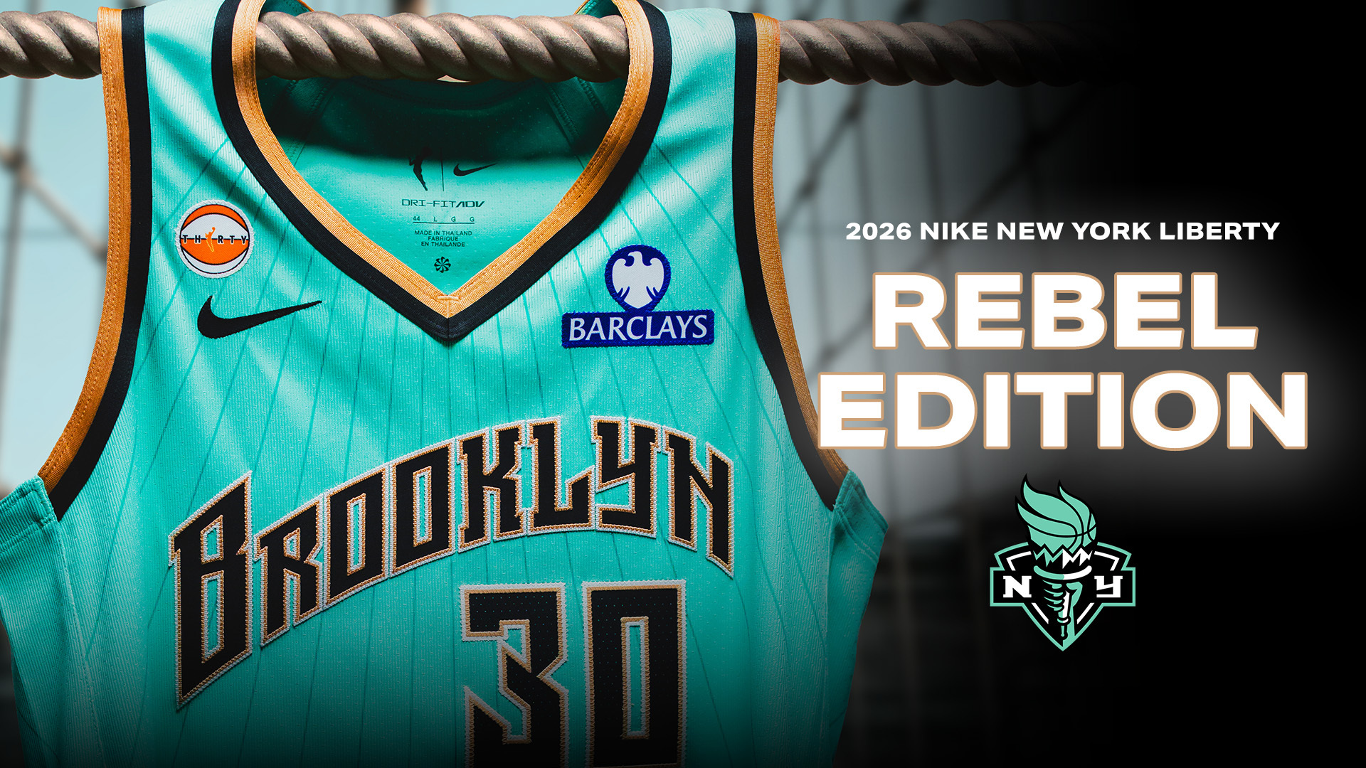
New York Liberty
Phoenix Mercury
Portland Fire
Seattle Storm
Toronto Tempo
Washington Mystics
,xPosition=.5,yPosition=.5) NewsNews
NewsNews,xPosition=.5,yPosition=.5) News
News,xPosition=.5,yPosition=.5)